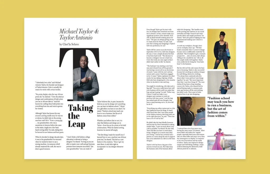
Magazines have long been a potent medium for visual storytelling, with their design evolving to reflect and influence cultural and technological trends. The unique visual language of magazines is characterized by a dynamic interplay between typography, imagery, layout, and color, all of which work together to create a cohesive and engaging reader experience. In analyzing the design trends of magazines, several key elements stand out, illustrating how this medium adapts to changing tastes and technological advancements. Typography remains a cornerstone of magazine design, often serving as the primary vehicle for conveying mood and identity. Recent trends show a move towards experimental typography, where designers employ bold, oversized typefaces, and unconventional fonts to grab attention and reflect the magazine’s editorial voice. This trend is particularly prevalent in fashion and lifestyle magazines, where typography is not just functional but also a design element that contributes to the overall aesthetic. The use of custom fonts and hand-drawn lettering has also seen resurgence, providing a unique touch that differentiates one publication from another.

Imagery in magazines has similarly evolved, with a shift towards high-impact visuals that capture the reader’s attention immediately. In the digital age, the emphasis on high-resolution photography and striking visuals has intensified, as magazines seek to stand out in a crowded media landscape. The integration of photography with graphic design elements, such as overlays and textural effects, creates a layered visual experience that enhances storytelling. Furthermore, the rise of digital platforms has introduced interactive elements, such as augmented reality features, which allow readers to engage with content in new and immersive ways. Layout design is another critical aspect of magazine visuals, and contemporary trends reflect a move towards more flexible and unconventional layouts. The grid-based structures of traditional magazine design are giving way to more fluid and asymmetrical layouts that reflect a modern aesthetic. This trend is evident in the use of full-page images, irregular column widths, and varied text alignments that create visual interest and guide the reader’s eye through the content.
Magazines are increasingly adopting modular grids and overlapping elements to create a sense of dynamism and to better accommodate diverse types of content. Color schemes in magazines also play a significant role in defining their visual language. Magazine’s for world trends show a preference for bold, vibrant colors and gradients that capture the essence of contemporary design. The use of color is not just about aesthetics but also about brand identity and emotional impact. Magazines often use distinctive color palettes to evoke specific moods or to align with seasonal themes, making color a powerful tool in visual communication. Typography, imagery, layout, and color work in concert to create a visually engaging experience that resonates with readers. As magazines continue to evolve in response to technological advancements and changing cultural trends, their design remains a testament to the enduring power of visual storytelling. Through their distinctive visual language, magazines continue to captivate and inform, solidifying their place in the media landscape.
